How to fundraise in a mobile world.
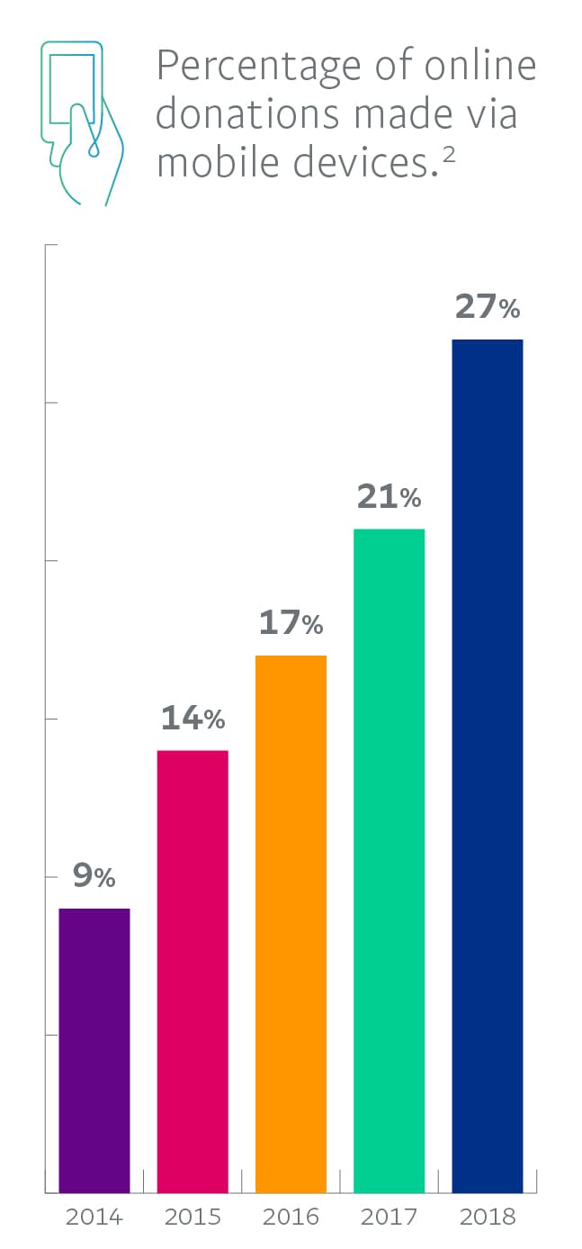
 Now is a good time to improve your mobile fundraising tools, since more people are using mobile devices to visit nonprofit websites, make payments, and donate money. In 2018, 48% of all nonprofit website traffic came from people using mobile devices .1
Best practices for mobile fundraising.
These simple changes can make your website much more usable on any mobile device – and enhance your visitors' experience across all platforms.
1. Choose clean and simple designs. Clear the clutter, minimize scrolling, and focus on one or two clear calls to action, enhanced by a single high-quality image.
2. Write short and sweet. Reduce the amount of text on each page, and break up text with headings. Use an easy-to-read font size and typeface.
3. Put content where users expect it. Consider what action you want to inspire on each page – then make it easy to accomplish. Add a prominent Donate button at the top and bottom of each page.
4. Add size and spacing to links and buttons. Are they large enough to click on small screens without zooming in? Provide enough space between clickable items so people don't click the wrong thing.
5. Make it snappy. Keep page load times brief – under three seconds is best. Remove anything that makes pages stall or fail to load.
6. Minimize data entry. Typing on a phone is a drag. Use autofill wherever possible, and allow people to donate as guests instead of requiring registration.
7. Reduce the number of clicks to donate. Simplify the payment process wherever possible. Offering PayPal as a payment option can streamline donations.
8. Test and analyze. Set aside what you think you know about your website and organization and go through your site as a newcomer. Find out how mobile users experience your site – then act on what you learn.
9. View your site through a mobile lens. Understand which tools and content don't render well on mobile devices, and think about how to make those elements more mobile-friendly.
10. Study email and social channels. Any marketing channels that lead back to your website should also be mobile optimized. For example, preview email templates on multiple mobile browsers before sending. Also, avoid multicolumn layouts in emails, since they force readers to zoom in or scroll. Keep email typefaces readable and images small.
11. Be the donor. Complete the donation process on a range of smartphone and tablet types, as well as web browsers. Ask recent site visitors or donors for feedback on their experiences.
12. Identify your assets. Which pages get the most overall visits? The most visits from mobile users? Optimize the popular mobile pages first. Home, About Us, Contact, and Donate are usually the first pages to address.
13. Get analyzed. Use analytics tools to track site visits. (Major search providers offer free analytic tools; consider using Google's Mobile-Friendly Test tool to see if your site is optimized for mobile users.) How much of your traffic is mobile, where is it coming from, and what do mobile visitors do on your site?
14. Optimize for in-person donations. Making your donation process mobile-friendly is not only good for online donors – it can help maximize your in-person mobile donations too. PayPal lets you accept in-person donations via a QR code, and with the PayPal Donate button, the QR code will link donors directly to a mobile-friendly checkout flow just as if they were clicking Donate on your website.
PayPal can help you become mobile ready.
Nonprofits trust PayPal as their payment partner for online donations: during 2019, people donated more than $16 billion to worthy causes via PayPal,2 and 27% of all PayPal payments to charities were made on mobile devices.2 PayPal helps create better ways to manage and move money, and offers choice and flexibility when fundraising or donating.
1 M+R, M+R Benchmarks Study, 2019
2 PayPal internal data, 2019.